Road Trip: Linseed Oil Factory

As students of the Fourth Semester Digital Media Arts course, we were part of an Interactive Development class. In this class, I joined a group of 4 people (including myself). This group contained very talented individuals, Keera O’Hanlon, Perrion Prince Peak and Abdullah Noorzaie. We decided to recreate a trailer of Outlast, a survival, horror game, where the main character is supposed to explore Mount Massive Asylum. We wanted to make this trailer would be somewhat similar to Darksiders II Trailer (Link: http://www.youtube.com/watch?v=BI_x-K8wY-A), where we incorporated real footage with videogame footage. As we progressed through our project, I was appointed to be the group’s Project Manager.

Eventually, we decided to look for an abandoned building to use as our location for our little trailer. Perion looked up for some abandoned buildings located in Toronto, ON, Canada. This is how we came across the Linseed Oil Factory, a factory which was shut down in the 1960’s. We ended up taking some photos while Perion, Abdul and I were there.

When we reached the area, we thought it would be a good idea to scout the area.

1

A distant photograph of the factory.

As we walked around the factory, we noticed how the graffiti had taken over the majority part of the building.

One of the many graffiti that can be found on the walls of the factory.

Walked a few steps to come across more graffiti.

Eventually, we ended up turning the corner, to me, this area was the most magnificent area to photograph.

We decided to venture around the factory.

As I walked by the factory, I noticed how the Sun was positioned on top of it, which made the place look beautiful. I decided to snap a few pictures. The lens flare made this image even more amazing and beautiful.

An amazing lens flare that formed while taking this amazing photograph

We decided to go closer to the factory’s fence. It was  very interesting to see the Sun hide behind the factory.

It was amazing to see the sun hide behind the factory.

I don’t know why, but for some reason, I found the corner very interesting.

The colored and grey scaled version of the graffiti was very artistic.

I then realized that it was this rusted, deformed pipe that was what caught my attention. Wonder what could have deformed it in such a way.

The rusted, deformed pipe

Suddenly, we decided to pose and take pictures of each other. Perion being the first person to pose.

He had a very unique style.

After he finished with his poses, he began discussing what our next move would be.

Perion being a director as we discuss our next move.

Then suddenly, he pulls off his jacket and starts posing again.

This is when we realized that we were about to go crazy, and have fun.

Next, it was my turn to pose in front of this wall. I have no idea why we picked this wall.

18

I have no idea why my hair color is so light here.

I tried to recreate a pose I had taken last year, in a completely different environment. The shot turned out to be amazing.

20

Recreating a picture from the past.

Throughout my poses, I loved this picture the most, as it gave off a sense of mystery.

21

One of my favorite pictures in this road trip.

Just being outside the factory gave me goosebumps. Wonder what would happen if we’re inside.

22

The beauty of this place was astonishing.

Sadly, the factory was locked up for safety.

23

No entry.

I stuck my camera between the barred door and tried to snap a picture of the interior. It was a very scary looking place, perfect for our little trailer.

24

The interior was very dark and scary. Sunlight would not go past the entrance. It was perfect for our trailer.

This abandoned bulldozer was the only thing that was accompanying the factory.

25

The abandoned bulldozer. The only companion of the factory.

This time, Abdul decided to jump onto the bulldozer.

30

Abdul decided to jump onto the bulldozer and pose for some pictures.

Perion accepted Abdul’s challenge and jumped on.

35

It was amazing to capture the factory peeping behind Perion.

Finally, I joined the crowd. I tossed my camera to Perion and allowed him to take my pictures. I was having too much fun here.

37

I was having too much fun on the bulldozer

After we went crazy at the factory, we decided to ask around if there was a way to enter the factory. We ended up entering this store (looked like a pawn shop, but was a prop rental store), were we were greeted by this dog. We were all scared of the dog, so Perion and Abdul bailed on me and waited outside. I went ahead and spoke to the store’s owner, who happily directed us to the authority that would help us gain access into the factory. This was the last picture I took before we left and headed for home.

41

As we entered the store/prop rental place, we were greeted by this dog. Who would just look at us. The store owner allowed me to snap a picture of her.

When we went to the authority, we were told to contact 311 to get a permit to just get past the fence. Sadly they wouldn’t allow us inside the building because of safety. This was a great adventure that came to an abrupt end.

Master Bubble Bubble Gum

This was an assignment where I had to choose between 4 different companies, and redesign their Logo. I picked Master Bubble Bubble Gum because, to me, it was something that I felt I could easily achieve.

Before I started sketching the Logo, I first listed the main (key) features that represented the company/brand.

Key Features:

  • Bubble Gum > Blows Bubbles
  • Mainly Pink color. Can also come in White, Black, Baby Blue, Grey and Yellow.
  • Mission Statement: Take it easy/ Float away/ Day dream.
  • Holds the record for blowing the largest bubbles.

Brainstorm1

Keeping this in mind, I began to plot down ideas for the Logo. I even thought of creating some sort of a superhero (named Master Bubble) as their Mascot/Logo.

Btainstorm2

I eventually took a break before resuming to the Logo because as I scribbled on a piece of paper, I was drifting away from what the brand represented.

Finally, I settled for this:

Final

I love this idea for several reasons:

  • The logo shows what the brand represents.
  • The logo shows history (holding the record for making the world’s largest bubbles).
  • The logo represents the Mission Statements of “Take it easy/ Float away/ Day dream”.

Now that I am satisfied with my basic sketch, this is the Logo I want to design (add more details, etc) for Master Bubble Bubble Gum.

After the sketch was completed, and approved by my Professor, I went ahead and made it into a vector format (below).

master bubble bubble gum

When making the vector, I had to take into account that the logo, both color and black and white version, would be suitable on any background. To do this, I had to add a thin, white outline.

blackbgwhitebgcolorbggraybg 

Character Illustration – The Meshiest Work.

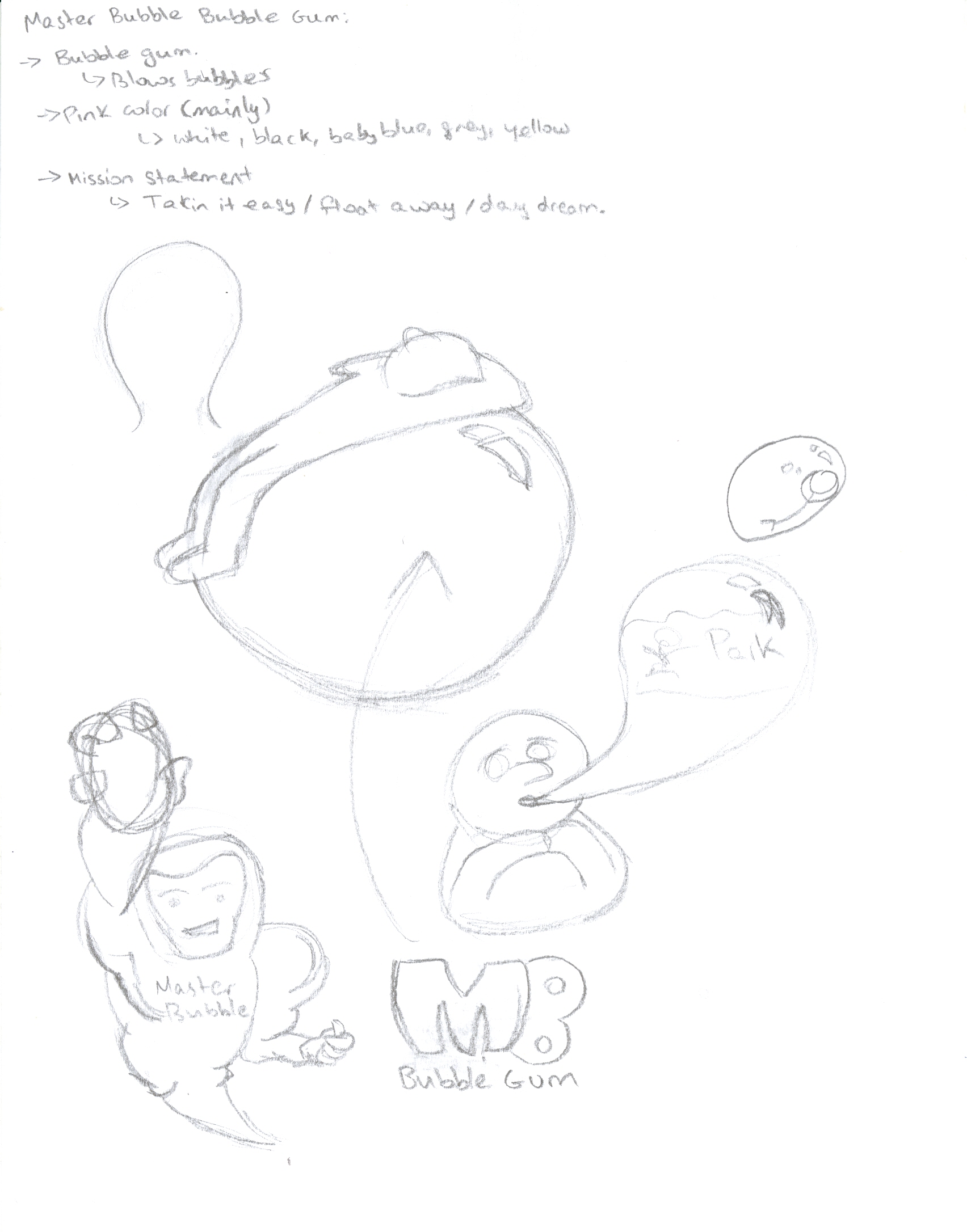
This is my final assignment for DMA 101. For this assignment, I had to contact an artist (or use my own work), and get their permission to use their work. I had to recreate their work on Adobe Illustrator. I had contacted around 12 artists. Out of which, only about 5-6 replied, giving me permission to use their work.

Their work was not approved because either their work was cropped or their work was too complicated/easy. Our professor was looking for a sketch that showed the entire body of the character

I finally sent in some of my work, along with works done by some more artists. I insisted that I was capable of using my work to complete the assignment. Fortunately, the work was approved.

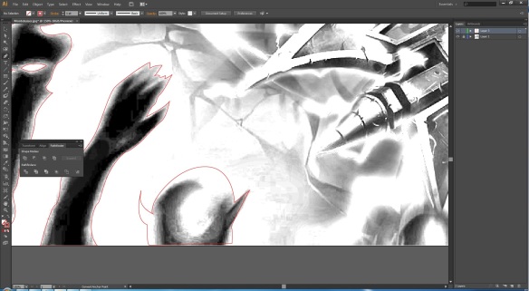
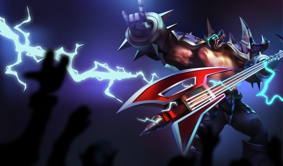
The sketch I used for my assignment is called Mordekaiser – Pentakill Skin. This is one of the skins Riot Games sells for their champion, Mordekaiser, on their game called League of Legends (also known as LoL).  I had made this sketch off the original artwork when this skin was released. I dragged the sketch into Adobe Illustrator and began working on it.

1

Where do I begin? The main character? The crowd? The background? It was too confusing. I kept deleting my outlines and trying out new places to begin from, hoping I could finally start.

The very first challenge I faced, as always, was where to begin? This sketch was an entire scene. Where do I begin? The main character? The crowd? The background? It was too confusing. I kept deleting my outlines and trying out new places to begin from, hoping I could finally start.

2

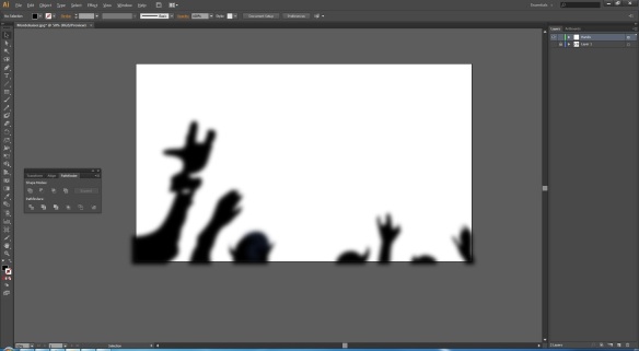
After coloring the crowd in, I duplicated the layer and added the Gaussian Blur effect to implement motion into the image. Satisfied with the work, I grouped the crowd into one layer and continued my work.

Finally. I settled for the crowd. They were the simplest. All I had to do was outline them, color them in, duplicate them and add Gaussian Blur to show motion. Satisfied with my crowd, I continued to bring this sketch to life.

3

Satisfied with the crowd, I worked on the background. The background was mainly a mesh consisting of multiple colors to implement a concert surrounding.

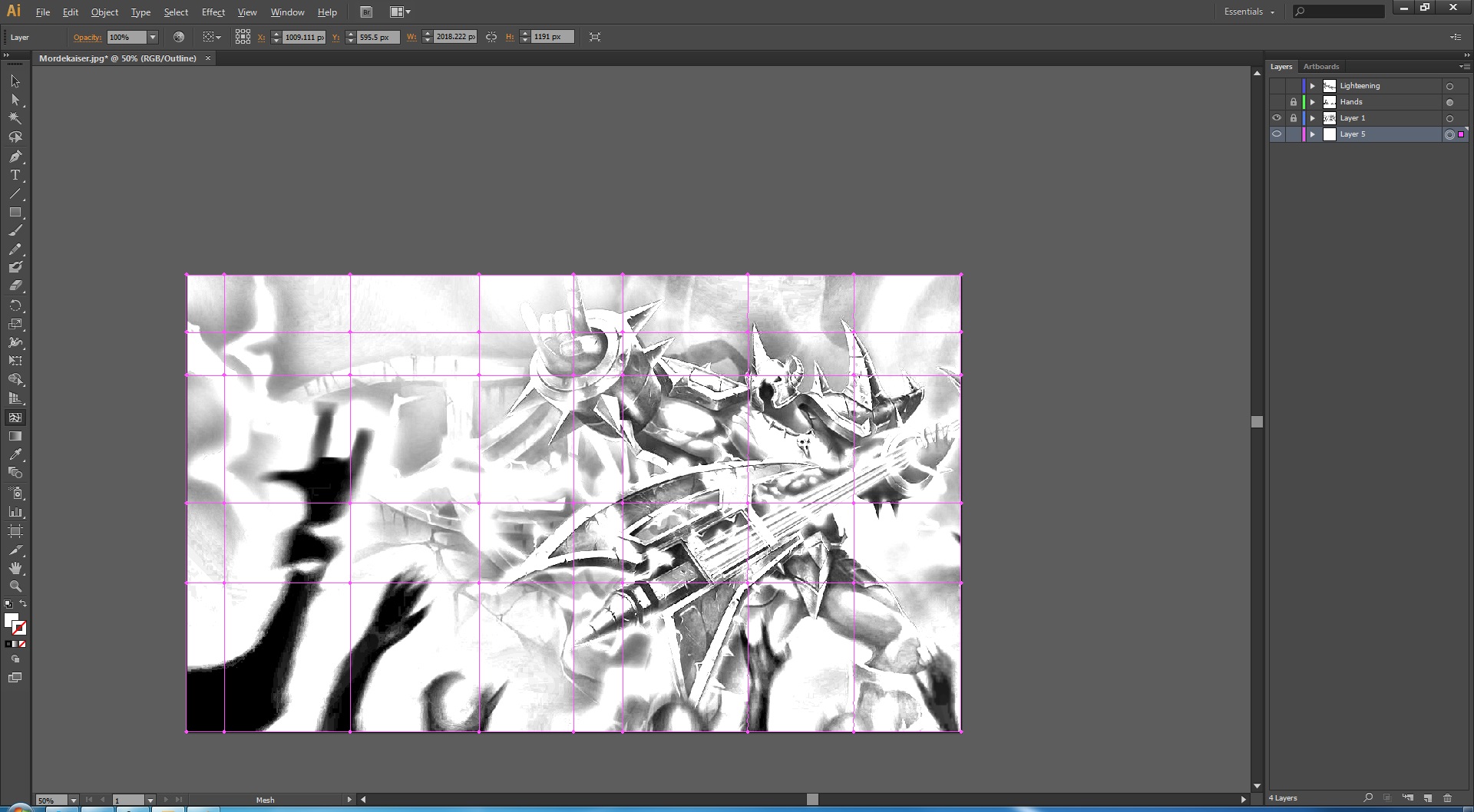
The next thing I decided to work on was the background. Since the crowd and the background were the easiest of them all, I thought that I might as well get it over with. The background was basically a huge rectangle, as shown in the image above. I transformed the rectangle into a huge mesh. I then added different colors to the mesh to implement a concert surrounding.

4

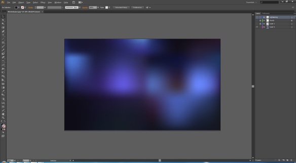
This is what the background looked like when I was done. I had to play a lot with the colors before I was satisfied with the background. It did not take too much time. I’ve always loved the mesh tool.

This is what the background looked like when I had completed coloring it in. The mesh tool helped a lot with this. The background looked very interesting, in my opinion. My next challenge was to use colors that would match the background.

Spoilers: I decided to stick to the mesh tool for the entire assignment.

The next day, it was time to bring in the work to class in order to show our professor the progress. He was quite upset at me because I “wasted” my time focusing on the background and the crowd rather than spending the time working on the main character. He said that I should have worked on the main character first because there was no point in having the background look pretty and the main character look unattractive if in case I ran out of time and had to rush it. I followed his advise.

5

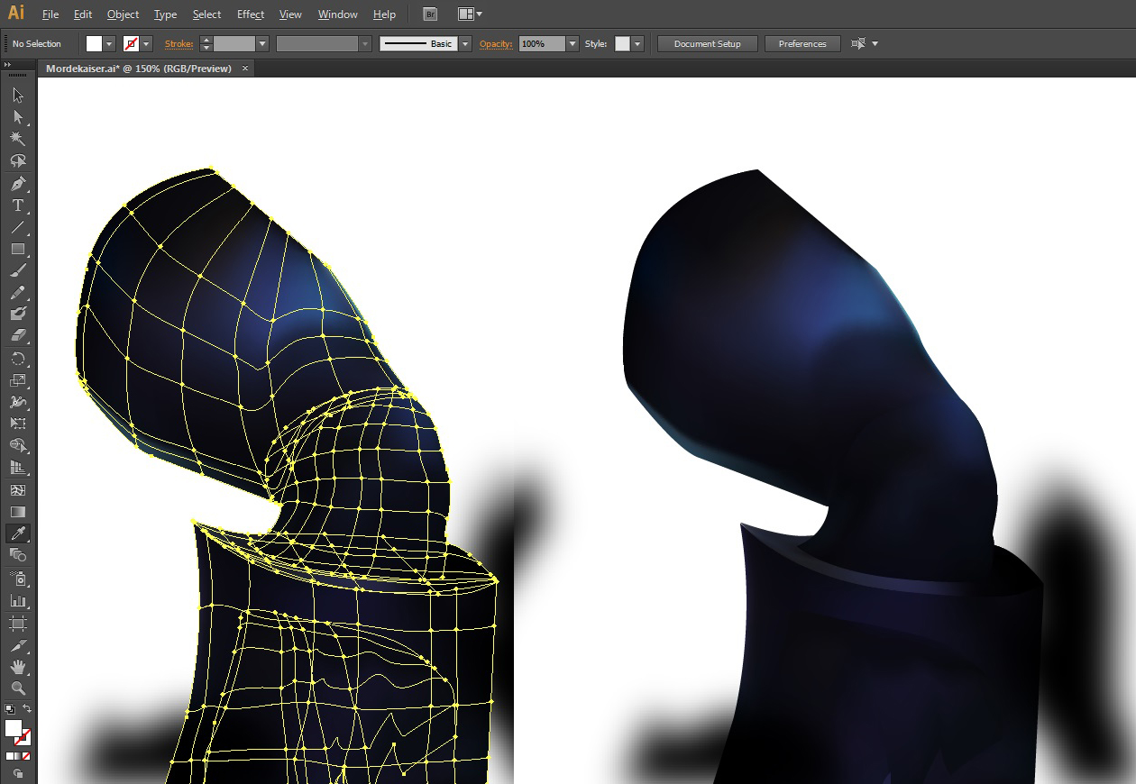
Left: Mesh of the leg. Right: Leg.
Following the professor’s advise, I began working on the main character. I decided to start with the legs and move up. Was simpler than I thought.

Following the professor’s advise, I began working on the main character. I had never expected that it would be so simple for me to create a mesh (left) for the leg. I was all hyped up and began putting in all my efforts into this sketch.

6

Above: Mesh
Below: Colored
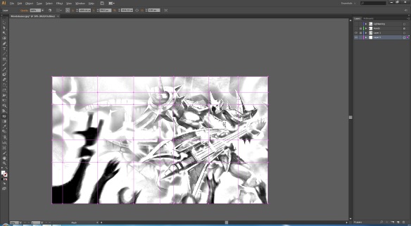
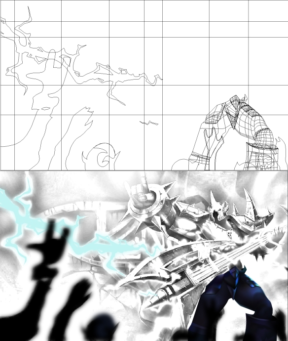
Excited about my progress, I got carried away and went back to working on the background. I decided to work on the lightening. I followed the same concept as the crowd.

Since I was too excited with the progress I had made (also I had no idea where to move to once I had finished with the legs), I got carried away and went back to work on the background. I was working on the lightening without even realizing it. The lightening followed the same concept as the crowd. I made the shape, colored it in, duplicated it and added Gaussian Blur. The only difference was, the blur for the lightening gave a glowing effect.

7

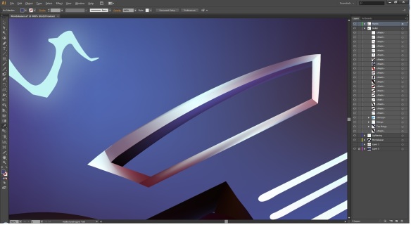
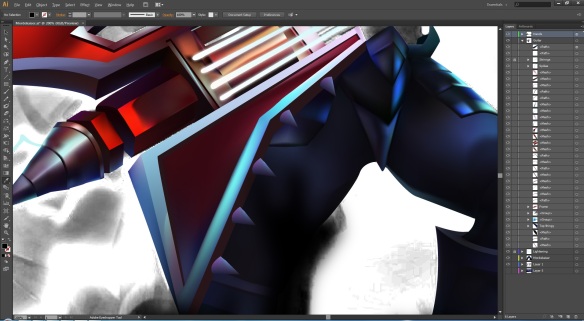
The toughest part of this sketch. The guitar was literally a nightmare to work on because it had too much details.

The guitar was the worst part of this sketch for me. It was literally a nightmare to work on because it had too much details. I spent a lot of time trying to figure out how to cut a hole into it. Remember: I was using the mesh tool. I could not use the pathfinder to “Minus Front” and cut a hole into the shape, so I went along and did the long, time consuming process of meshing every single shape and working my way around the holes.

8

A sigh of relief escapes from me as I see my work coming together. Was satisfied with the guitar, so far… The nightmare hadn’t passed.

I zoomed out to look at my progress on the guitar. A sigh of relief escaped from me as I saw my work coming together. It was a very satisfying notion to see the guitar finally working out. The nightmare wasn’t over though. The guitar was still incomplete.

9

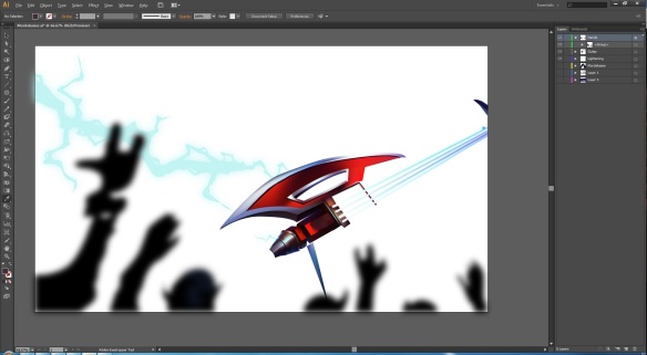
Continued to work on the guitar. Filled in the missing pieces and added the spikes. My kind of weapon.

Satisfied with the progress on the guitar, I resumed working on it. I also added a glow effect to the strings. I used the same method that I used for the lightening. I wasn’t sure if it was just me, or if the guitar seemed a lot more simpler to work on. Finishing it of was like passing a knife through butter. Either ways, it worked out great and I was happy.

10

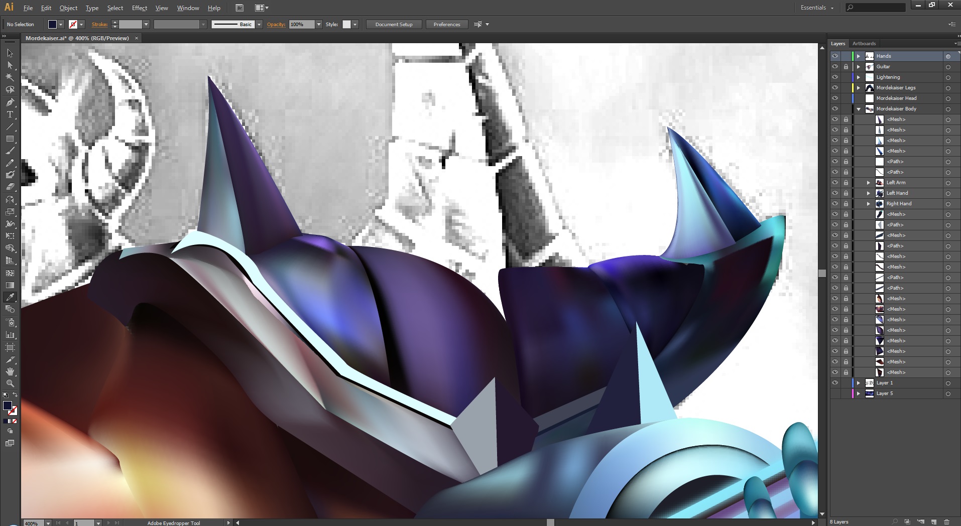
The nightmare was over. Time to work on the shoulders. I had literally completed the entire body. Only the shoulders and the head was left now.

The guitar’s nightmare was over. It was time I worked on the shoulders. I had literally completed the entire sketch. Only the shoulders and the head was left. The mesh tool was very tough to use on these shapes. I had to undo repeatedly before I was satisfied with what the mesh looked like. I was glad that things were working out for me.

11

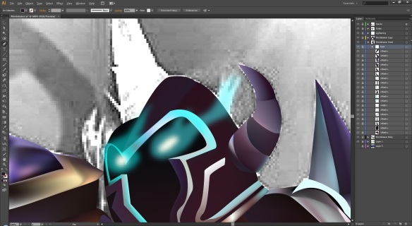
The eyes. One of my favorite parts. I loved the glow that came out of these eyes. I wish I could have them.

The eyes were one of my – no, they were my favorite parts of the sketch. I loved the glow that came out of them. I followed the same principal of adding the Gaussian Blur to them. I also added a hint of opacity for extra flavoring (making the glow look more realistic).

12

The colored version over the sketch. Looked great. Was one of my best works so far.

After I had completed meshing up everything, I thought of previewing it over the sketch. It looked fabulous. This was one of my best works so far. After finishing with the eyes and the head, I resumed my work on the lightening. It felt great to see myself come this far with the work. The main concern I had was that Illustrator might crash, so I kept saving every now and then  because I did not want to lose this much progress.

13

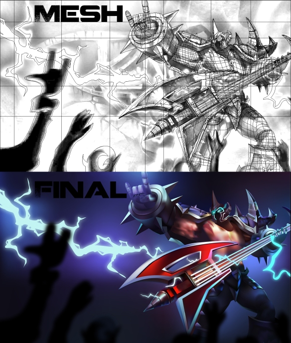
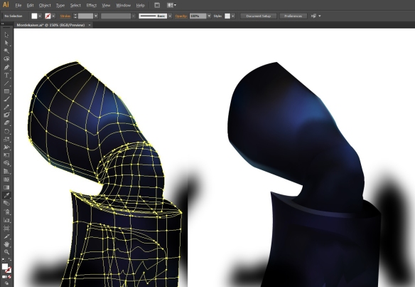
Comparing the mesh and the finished piece. The mesh itself looks too good.

Once I was done, I viewed the mesh over the sketch and was in love with my work. The mesh alone looked too good. This was one of the meshiest works of mine (pun intended). Seeing that it was completed, I had a smile on my face because this was something I myself didn’t think that I could achieve.

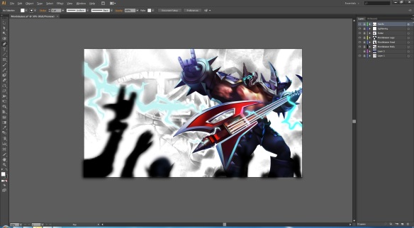
This is what the finished piece looked like. I omitted the symbol in the background, and his necklace. I felt that they were making the scene look too crowded. I also omitted some of the lightening.

Mordekaiser final-01

The most amazing thing was that this piece took me only 10 hours (or less) to complete. Of course I could have added the necklace and the lightnings i had omitted, but to me, this work feels like it’s had enough of me. After I was done, I went back and tried to fix the neck. If you noticed on the image above (the one with the mesh and the final below it), it looked as if I had just stuck the head on the body. On the other hand, the image above shows that the head actually belongs to the body.

Hope you all enjoyed this little journey of Character Illustration. I call this work: Mordekaiser – Pentakill (Pentakill means 5-kills. In the game League of Legends, the champion, Mordekaiser, is known to kill all 5 of his opponents. I love this guy).

Shoe Ad

We had to photograph shoes and make it into an ad. So I used the shoes that I wear everyday because I had them for a really long time. Moreover since I wore them frequently, they had become dirty, so I thought they’d make into an interesting ad.


Here’s the shoe photograph I used:

Shoe Blog

Original photo


My next job was to convert this into an interesting ad. With the slogan “Time to get dirty” in mind, I set out to make the shoe look as messy as possible. I used the “Oil Paint” tool under Filter, which made the shoe look dirtier than original. I also used the Reebok logo to rest my shoe on because I did not like the idea of the shoe floating in mid-air. I kept the background transparent so the ad could be placed on any color background. So in the end, this was what I came up with:

Shoe Ad

The ad

Sports Logo

5265

Arkansas – PB Golden Lions Logo

This is the original logo that I used for this assignment. I got it off from: http://www.sportslogos.net/logos/view/5265/Arkansas-PB_Golden_Lions/2001/Primary_Logo

Image

The strokes

Although this was the simplest of them all, one of the first challenges I had come across was picking the right color for my stroke. I’m not sure whether it was just me, or the image’s pixels, but for some reason, I could barely see the strokes of my path. I had basically started off with Red Stroke, then switched to the Green Stroke, then finally settled down to the Yellow Stroke.

Image

The curves

Now that the Strokes were out of the way, my next challenge was the curves. This logo had too many curves on it. Even the lines that seemed to be straight had a very small curve on it. It was either that, or the fact that the image would curve one way, and then all of a sudden, the curve would go the other way. I had to spend quite some time trying to get the curves right.

Image

The mouth

The mouth of the lion was the toughest part. Mainly because the pixels would mix up too much when zoomed in. I had a hard time getting a proper path for the tongue and the teeth mainly because there was those white strokes inside the lion’s mouth (behind the tongue) which did not really make sense to me. Moreover, the teeth would become too blurry when I zoomed in, this caused distortion.

This is what the finished logo looks like with all the other information added: Logo

Finally, tossing in a time lapse video showing the entire recreation of the logo on Adobe Illustrator (thought it would be interesting.):

R8 Design Process

Starting out with the website

The moment I opened up Photoshop, I was faced with a challenge. I am not a huge fan of mathematics. Therefore, I had to come up with dimensions that were simple to calculate. I finally came up with 1200 for the width. The height did not matter because I knew that I would be adding to it later on.

The next challenge was to come up with a background. The theme for the website was dark, so I went around and looked for some black background. I finally decided to choose the one above because the stripes and black gradient gave the feeling of a car’s tire. Little did I know that this background would make my life harder in the end.

Calculations gone wrong because of a silly mistake. Background makes the grids harder to see.

I continued to work on the website with the current background. I pulled up the grids and that’s when I realized that the background I was using was making things literally impossible to see when zoomed out to 100%. Every now and then, I had to zoom in to add, re-size and align my things. I decided to continue working with this background either ways.

I thought that it would be a good idea to work from top to bottom. Doing so would be a simpler approach and that it would be easier for me to do the calculations this way. I added a guide at 100 pixels, and then split it in half in order to add the two banners. I then proceeded by adding the banners, coloring and beveling them both to give a 3D effect.

Balancing the columns and adding the Logo

I then went ahead and added the Audi R8 logo, as this was a website for that car. After adding the logo, I thought it was time to work on the body of the website. Something did not seem right though. I noticed that the body was not split into 2 equal columns. The column on the right was wider. What had I done wrong? I pulled out the Rectangular Marquee Tool. I wanted two 490 pixels wide columns with a 20 pixel gap in between.

I set the Marquee to Fixed Size and changed the width to 490 pixels. I then clicked on the guide marked at 100pixels. I found my mistake. Instead of drawing my guide starting from 100 pixels to get the right dimension, I had drawn the guide from zero pixels. In other words, the column on the left measured 390 pixels wide instead of 490 pixels wide. I fixed that error with the help of the Rectangular Marquee Tool  and moved on.

Working on the Slideshow

It was now time to go back and work on the navigation panel. As simple as it seemed, I came across a handful of challenges here. My very first challenge was that I had to enlarge the grey banner in order to fit the logo. The flaw in this was that my navigation looked imbalanced. There was too much space on above each button.

My second problem was that I could not figure out a proper color that would be a suitable font. I felt that white font would make the website too plain, so I picked yellow. It seemed to work well. I then went onto some Audi websites to see what else these websites had in their Navigation Panel. Once I was satisfied with my pick, I moved on to work on the Slideshow Panel. Note that I had my grid turned off. This was so I could see what I was doing because the background and the grid turned on made everything impossible to see.

Working on the body of the website

Thanks to the grid and the background making things impossible to see. I actually had to zoom in to around 200% to see what I was doing when I started working on the body of the page. I also took this as an advantage to align my images and texts. I continued to use yellow colored fonts for my website as this color popped out more compared to the black and white around it. Everything seemed to work out great. I also opened up the Character window to align and adjust my text. Little did I know that when I zoomed out, the text would be huge. I thought that it would be a good idea for the text to be big, so I continued my work.

Looking at the disaster.

After completing the body, I zoomed out to look at my masterpiece, or was it a disaster? It looked more like a disaster to me. The fonts and images were huge, even when I zoomed out to about 75%. “This was unacceptable!” was my first thought. But then I reconsidered and continued to with the website. My next challenge was that I had very little content on the body. How could I fix that? I added two arrows labeled “Previous” and “Next”. These would navigate the viewer to more information about the car. I also got really frustrated with the background disrupting my view, so I changed my background to a radial gradient. The gradient was not too strong. It turned from dark grey to black as it moved outwards. This was a more pleasant background to work with.

Working on the footer

Satisfied with everything, I went ahead and finished off the footer for my page. I used many different websites as references for my footer. I also added images of many social networking sites to show that the brand is active and has given many opportunities for their fans to stay up to date with them. I also went onto one of the Audi websites and pulled out different models for their R8 to construct the Sitemap. As I was navigating through that website, I found out that they had an “About Audi” section. I liked it a lot so added that into my website design too. I also added a gradient panel to my “Previous” and “Next” buttons in order to give them an entirely different section of their own. Finally, my website was completed, or was it?

Scrapping out the entire body, then going back and working from the top again.

The next day, I went back onto Photoshop and I zoomed out to 100% to look at my disaster. Yes, this was when I realized that I had created a monster. Everything was imbalanced. I cleared out the entire body and started to work from the Navigation Panel again. I put the “Audi” and “R8” logos next to each other. This helped by reducing the grey banner’s height to 50 pixels. The banners were finally balanced out. The next thing I thought was, “Why would they provide all the information on their ‘Home’ page?”

Instead of using the “Home” page as my selection, I chose the “Audi Technology”. This is where all the information about the car would reside. I added inner glow to both, the rectangle selection and the font to make it stand out. I then went to work on the slideshow. I kept the same image, but added opacity to it. I removed the “More Images” and enlarged the numbers. This build looked better than the previous version. At this point, I was critiquing myself.

The new body of the website.

It was finally time to go back and re-work on the body of the website. My very first problem was splitting up the width into three equal columns with a gap of 50 pixels in between. I really hated doing the calculations, but finally, 300 pixels wide columns seemed like a fitting idea. The Rectangular Marquee Tool’s height was set to 200 pixels by default. It was literally a miracle. Everything was fitting perfectly on the page now. The only thing that was eating at me was that I did not want the body to be plain images and text. I became more creative. I decided that I would convert every image into a video. This would probably get the person browsing this website more interested. I continued to navigate through the Audi website to find information to add onto my website. In the end, this was the masterpiece I should have created in the first place.